3 different types of users that may not use the system’s features frequently:
• Nurse
• Doctor / Anesthetic
• General Technician
Different working environment:
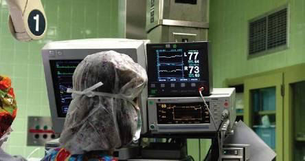
• Trauma
• Intensive Care Unit (ICU)
• Operating Room (OR)
There is no effective bedside monitoring solution. Most hospitals in the US do not have a Magnetic Resonance Imaging (MRI) machine available for emergency screening. Ornim's solution complements Computed Tomography (CT) and should be used as an adjunct to CT in early diagnosis and initial patient assessment on arrival to Emergency Room (ER), for more rapid patient assessment.
3 different types of users that may not use the system’s features frequently:
• Nurse
• Doctor / Anesthetic
• General Technician
Different working environment:
• Trauma
• Intensive Care Unit (ICU)
• Operating Room (OR)
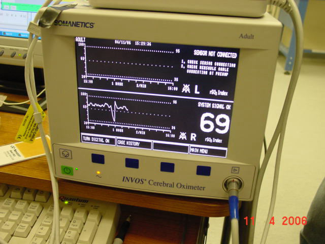
Different light conditions will require a bright text on dark background interface
Monitor placement doesn’t have to be on a rack. Vital signs monitors frequently positioned on a rack that is placed 1.5m – 2m from the patient’s head.
In our research we relied the Ornim's Subject Matter Experts (SMEs) as proxies. SMEs have domain knowledge of the target users. They provided us a valuable information and insights in the absence of access to the actual end user. The database gathered as a result of observations, meeting with medical staff (physicians, nurses and anesthetists) and additional data achievement from other resources.
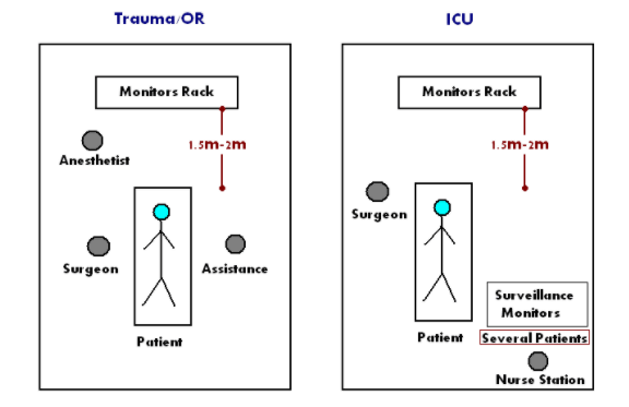
We put Trauma and Or together although it’s not obvious that both units are presented alike all over the sits. Furthermore, these three different units types (Trauma/OR/ICU) might be equipped differently under changeable constrains from place to place so the quick sketch illustrates typical layout as a base line for the UX research.
We conducted discovery sessions with our clients. Together, we map out the current ecosystem for the product, including stakeholders, tools, technologies, and the flow of data and information.
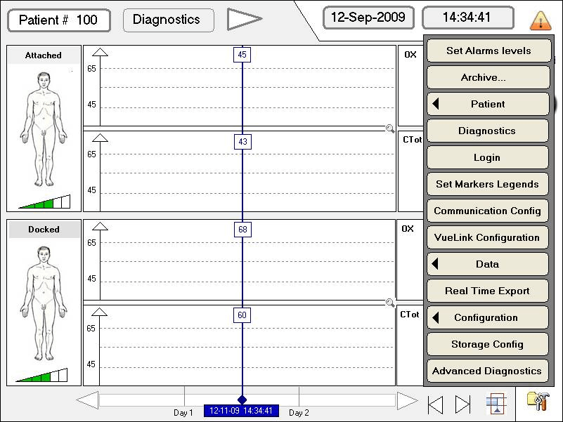
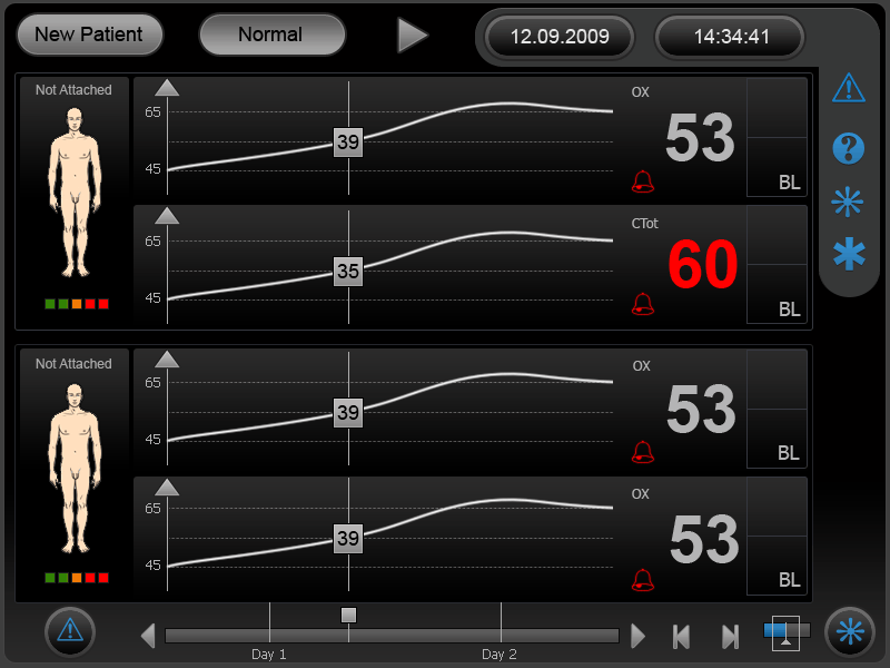
The main screen has been designed to allow users quick access to primary functions of the application. The size of the icons make tapping easier, the order of the icons are based on ease of reach and the layout was chosen to provide a way for the design to scale for future releases.
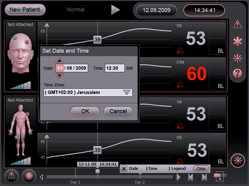
• The user interface should be composed of graphic display of the trend oxygenation vs time graph per sensored region and numeric/color coded display of measured oxygenation real-time.
• Events and alarms should be user defined, for controlling the thresholds for which users (doctors, nurses) want to be notified by.
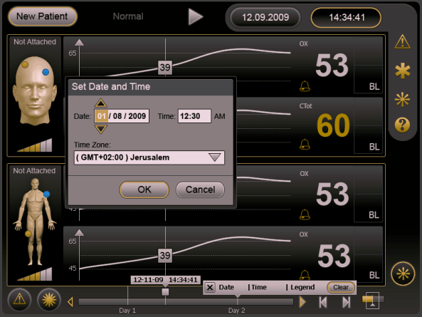
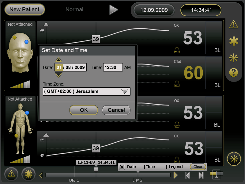
• Reference baseline – starting point oxygenation – baseline of this patient, should also be displayed per region assessed. Grid manipulation and date/time entry/change.
Wireframe
Work in progress..
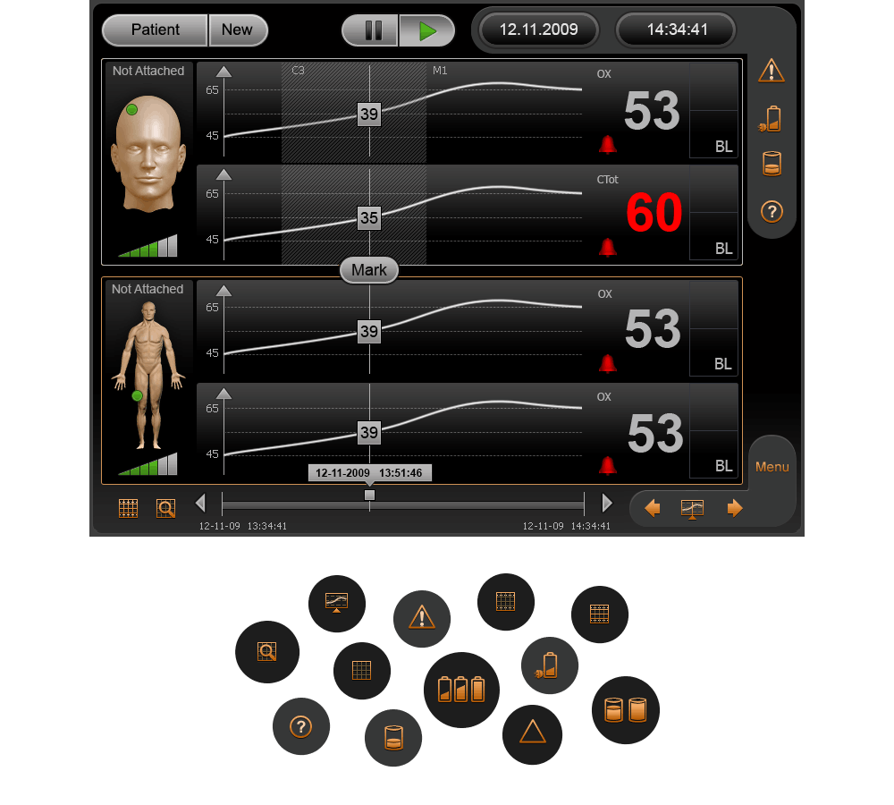
Main view with a bunch of custom icons for alarm, battery status, storage, help, grid and markers
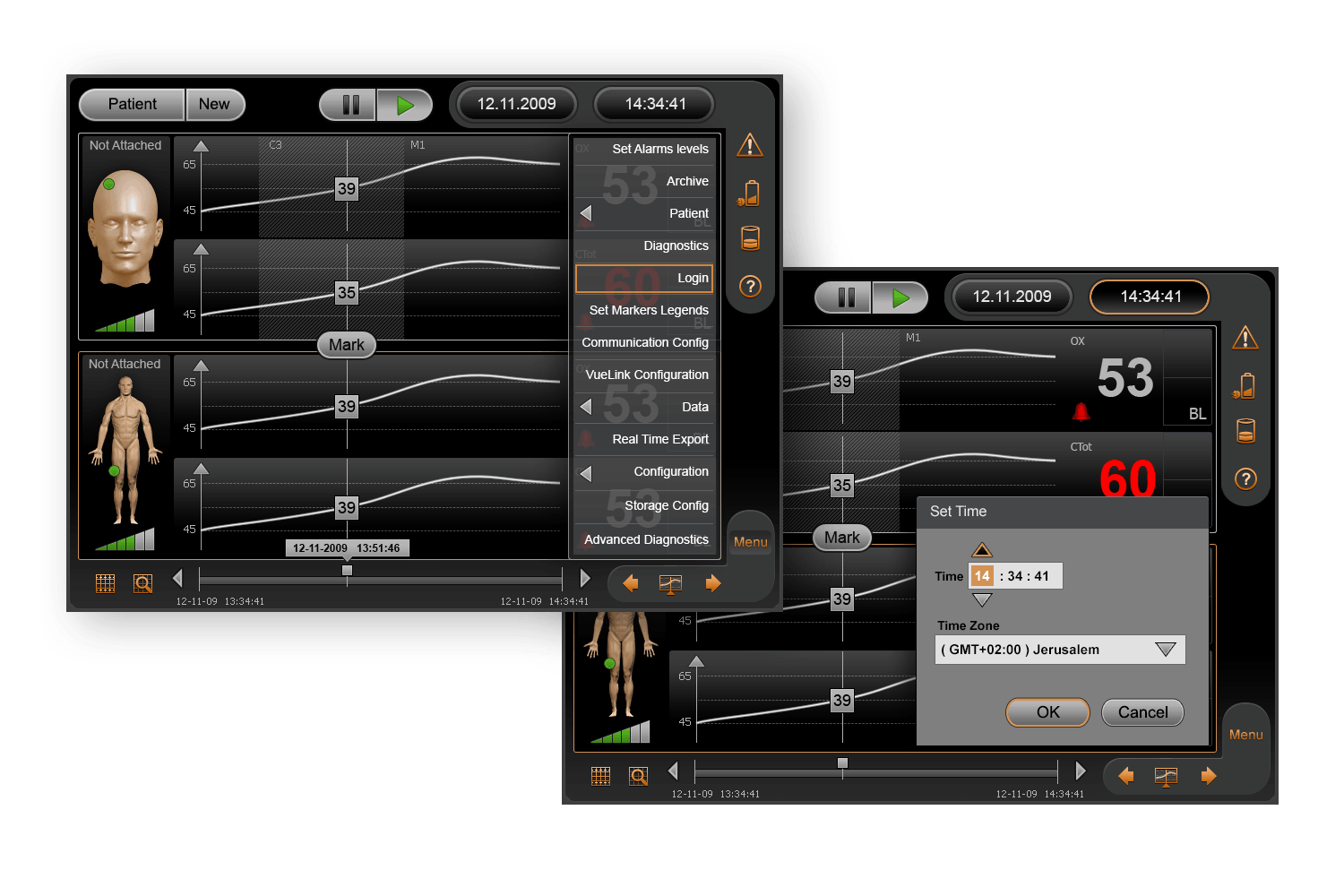
Menu and Dialogs
The interface design strives to be confident. It does not contain UI‐bling or unnecessary elements. I opted for clear, readable typography —choosing colours with high contrast to increase legibility in different light conditions. The design is uncluttered, clean, large and well spaced. All my design decisions help to exude a sense of confidence in the design. By working alongside with Researcher we have coped with the main tasks assigned to us in the best way possible
Video credit: Ornim Medical
Considering that this was my first project for touch devices, I am still proud to be involved in a project that can truly save human life. In fact, being the one who helped create it. I have always felt the need to make life easier for people. Knowing the users and putting yourself in their shoes is important, considering accessibility, diversity and inclusiveness.
• Always back up your design decisions with data. Without data, you’re just another person with an opinion. I would hardly imagine myself as a surgeon (to picture myself as a patient is much easier)). Therefore, in the project like this, data is a crucial factor!
• Attract the user’s eye. Be represented visually so the user understands that they are tappable elements. Be legible, so the user understands what action they will perform. Be large and clear enough so the user can easily and confidently tap them.
• The perspective is very different from a creator’s point of view versus from a user’s. It’s critical to set ourselves to the starting point and re-discover the living world; your thought will change and you’ll be more flexible at tackling issues from both a designer and a user’s perspective.
2025 © Anatoly Slobodskoy