As an international B2B oriented company, operating mainly in Western Europe, Cemantica approached me with one primary objective — to build web-based application that will help automate the journey mapping creation, replacing the existing sticky-notes mechanism that is widely used.
It should propose designs for the different web pages, taking into consideration the Logo theme and colors that are already in place. The designs should be smart & simple, reflecting the values of the company and helping the user navigate simply between the different parts of the tool.
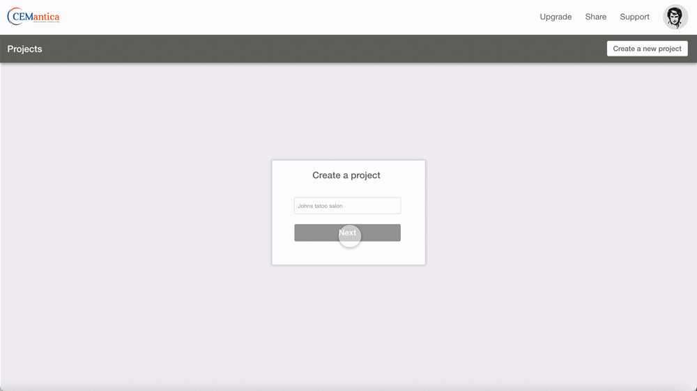
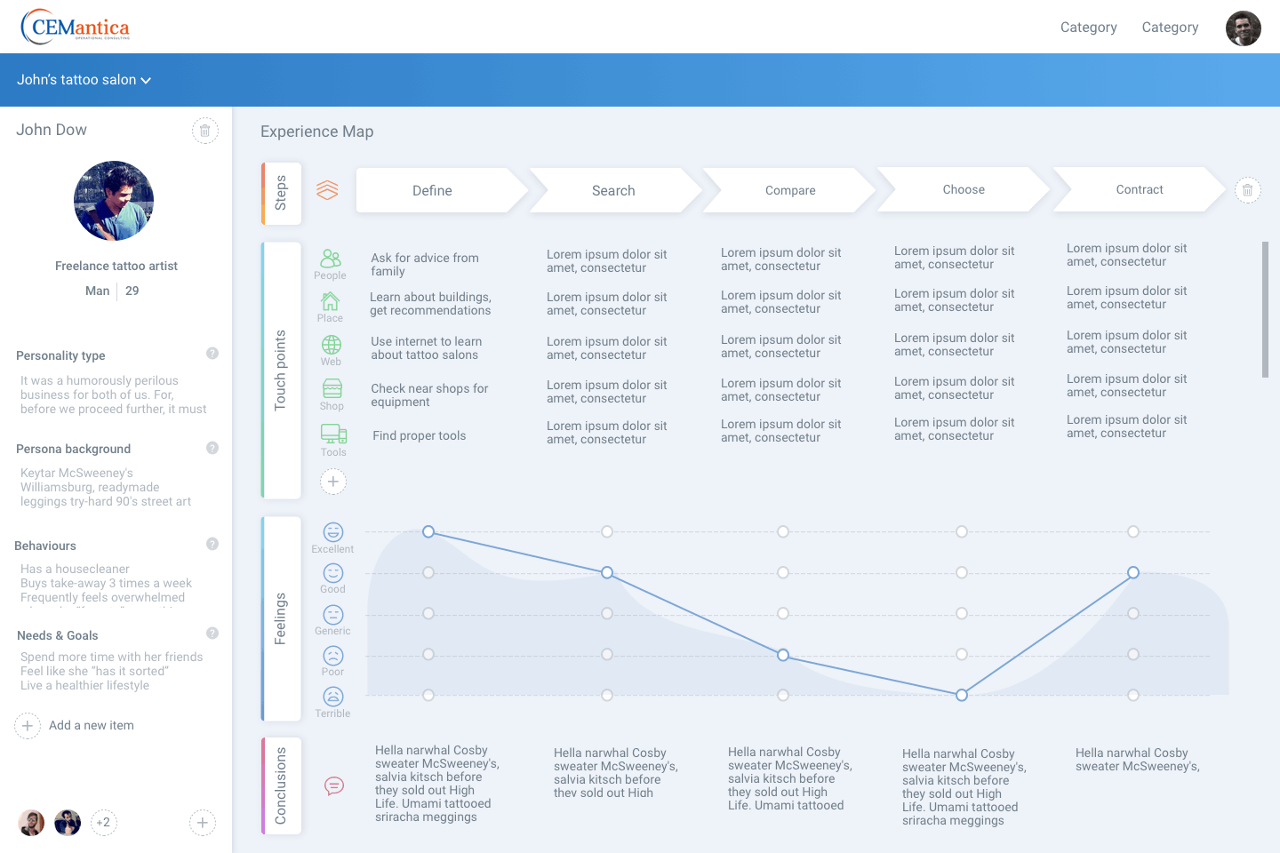
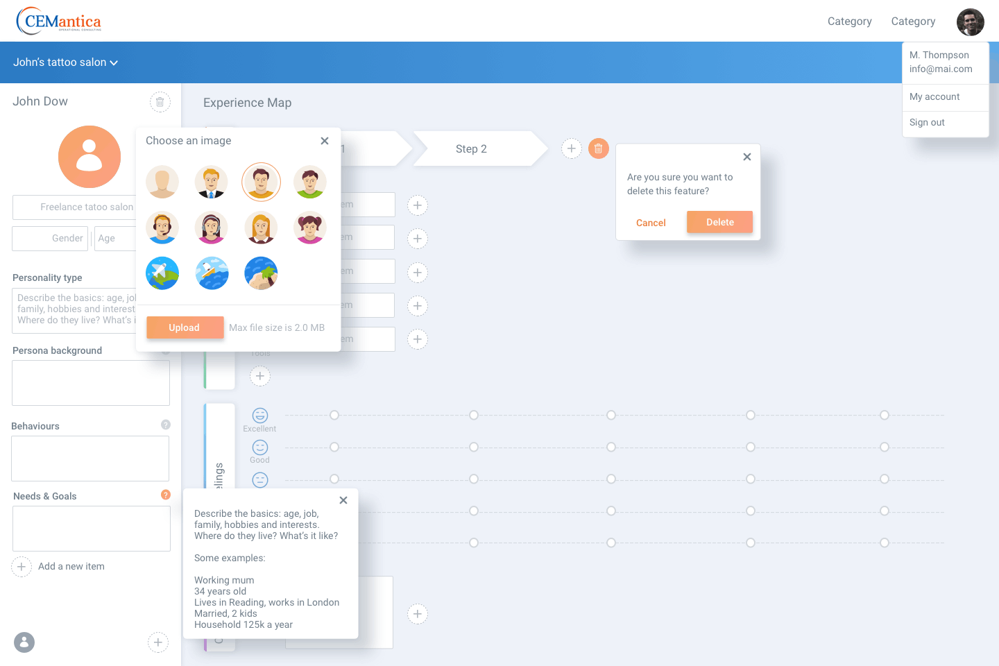
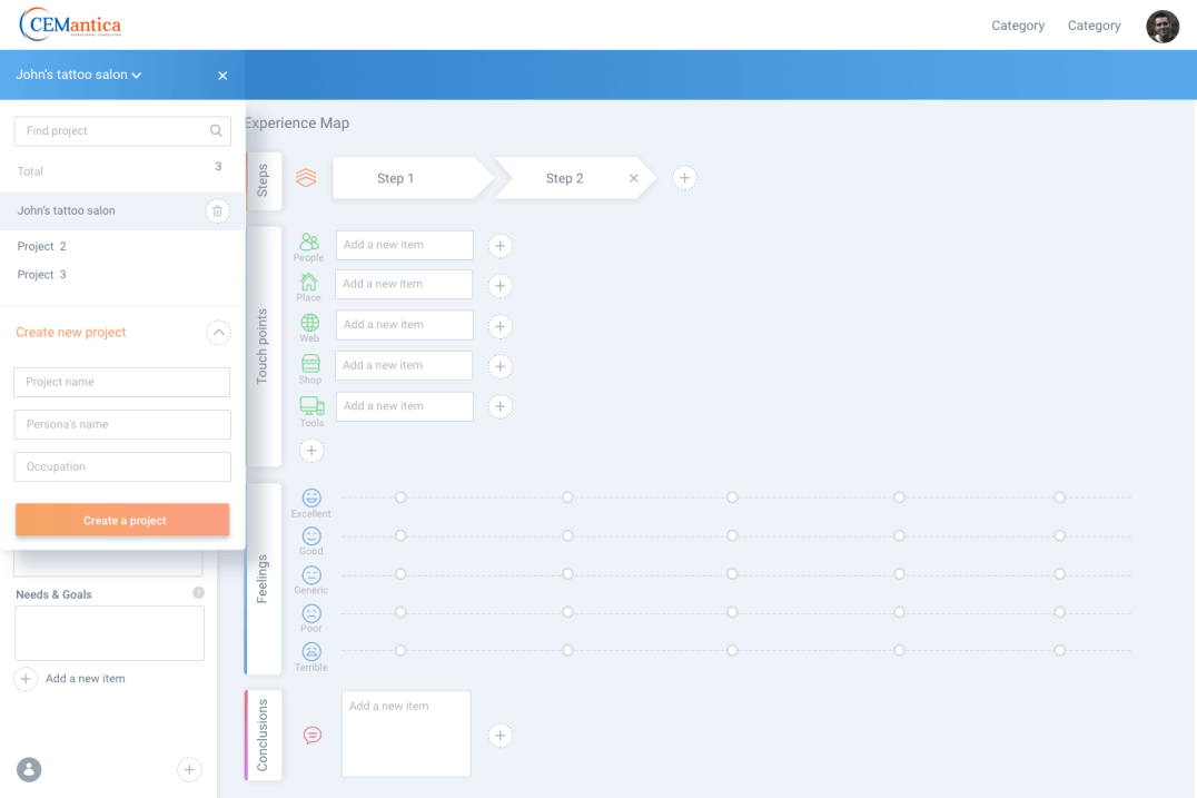
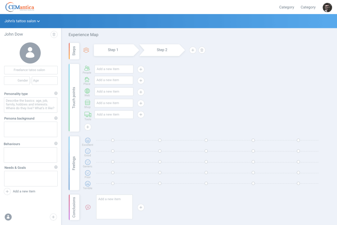
The tool would be accessible from either the website of Cemantica via the login area or from Microsoft Dynamics 365 through a dedicated menu embedded in the Sales & Marketing panes.
I was under extreme pressure to move fast as I was tasked to deliver a high‐fidelity prototype to the technical production within 2 months.
My research applied to products from the field of CJM, with a focus on delivering a smooth customer experience and to gain ground by optimizing the customer journey.
Also, general advantages and disadvantages of online CJM tools and the question of how company's values could be integrated into the context of the final design was an important part of the research. In the process of analysis, I looked (and tried) dozens of tools on the market: Visio, Gliffy, Smaply, XPressia, Touchpointdashboard and so on..
The creation of competitive profiles (in terms of marketing strategy, target market, core business, usability, layout, navigation structure, compatibility, content, design and performance) together with SWOT analysis helped to assess current offers in this area.
The main target audience accessing the tool was users from companies who seek to map the journeys of their customers (mainly from Marketing departments). Their target would be either to replace existing sticky-notes in place or start from scratch and use modern tools to accomplish the journey mapping work.
Before jumping on details, I needed to validate navigation principles. It allows me to understand how users would work their way through the product. Designing the user flow helped me ensure the experience is smooth enough. Once I got a better understanding of what I wanted to do and the issues I should tackle, I took some time to sketch layouts in Adobe XD.
After some prototyping adjustments and wireframes, mid-fidelity prototypes were created, which I supplemented with clickability using Adobe XD. Again, user tests revealed small vulnerabilities in the structure of the user interface, in some formulations and interactions.
Less Is More
It was popularized by architect Ludwig Mies van der Rohe in describing the minimalist aesthetic. In design, less is more is achieved by using only elements that are necessary to a given design. Using less to achieve an effect that's more than the sum of the design's parts is the goal. Minimalism sounds trendy, and it may very well be a trend. However, the philosophy of minimalism is timeless.
Add new project
No data
• The main lesson I've learned is to stick to business requirements.. It allowed me to be efficient, transparent and focus on creating the best product possible.
• Considering that this tool is in widespread use and has been on the market for a long time, it was important for me not to copy existing products, but to meet the business requirements and customer expectations.
• The right process and research helped me focus on the main components, which made it possible to finish the project on time, so as not to delay the development.
• Journey Maps are my new best friend. On the one hand it helps analyze a comprehensive process and uncover problematic and promising points, on the other hand to provide a basis for good cooperation for all stakeholders.
2025 © Anatoly Slobodskoy